9 6 月, 2026
In
Greener
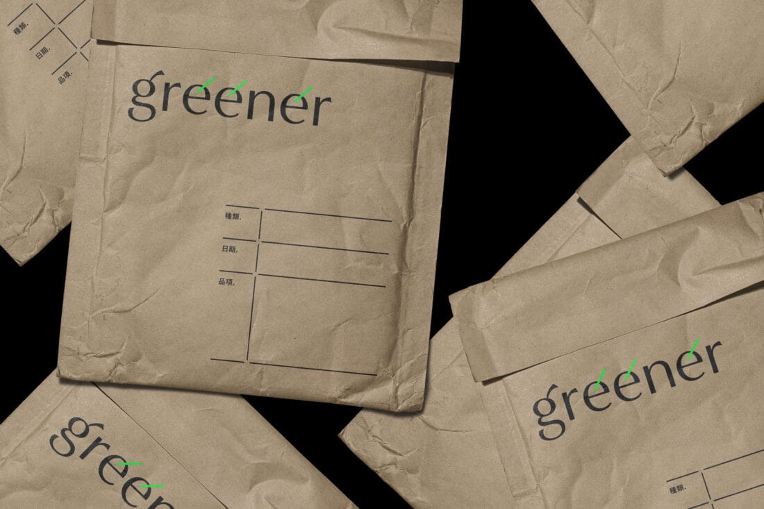
Greener Greener|品牌識別設計Greener 精選各式高品質植物種子與獨特植栽,植物不僅是空間的裝飾,更是心靈的解藥。帶走專屬你的那一抹綠色,讓美好心情從角落開始萌芽!Greener offers high-quality seeds and unique plants. They believe plants aren't just decorations—they're a remedy for the soul. Bring your home a shade of green, and let a better mood bloom from your corner!Year Client AD+D Scope2026GreenerChoi HiochengBranding